


OVERVIEW
Project Logistics
Timeline
January 2025 - May 2025
Team
2 Product Managers; 6 Consultants
Role
Associate PM & Consultant
skills/tools
Product Strategy, Web UI/UX, Client Work, Figma
Context
Microsoft offers business services across HR, Marketing, and Sales, enhanced by Copilot — an AI assistant that drives productivity and automation. In Sales, Copilot helps teams streamline workflows, analyze customer data, and personalize engagement.
As Gen Z enters the workforce and reshapes expectations for digital tools, Microsoft sought to explore how Copilot could deliver meaningful value to sellers and the new, AI-native generation of buyers.
The Question
How might we leverage Gen Z’s digital fluency and comfort with AI agents to design more effective, personalized, and trustworthy sales interactions?

The Research
Grounding the Problem Space: Starting with the Research
Reading the Literature
I reviewed 9 academic papers to understand Gen Z's experience with AI — focusing on pain points and positive interactions.
Hearing from Users
I conducted 16 user interviews (30 - 60 minutes each), evenly split between Gen Z users and B2B buyers.
THE Insights
What we Learned
Key Gen Z User Insights
Frustrated by AI that feels generic, inaccurate, or scripted, especially in current service chatbots
Expect AI interactions to be fast, personalized, and transparent, delivering context-aware, relevant responses
Frequently encounter issues with AI’s low accuracy, generic responses, and insufficient customization in AI workflows
Key B2B Buyer Insights
Burdened by time-consuming research and endless product comparisons, especially for high-stakes purchasing decisions
View AI as not yet seamlessly integrated into their workflows, leading to uncertainty and hesitation
See AI’s potential for automating low-risk, repetitive tasks, but want to retain control over strategic decisions
Gen Z Buyer Shared Takeaways
Both Gen Z users and B2B buyers view AI as a supportive tool — one that should enhance their decision-making process rather than replacing human judgment or autonomy.
To be effective and trusted, AI must: simplify complex tasks by streamlining workflows, reducing cognitive load, and minimizing manual effort; adapt to user context by being aware of user needs, preferences, and goals in real-time; and preserve user control by enabling transparency, offering choices, and avoiding over-automation in critical decisions.
What this meant for the Design Direction
From these insights, the takeaway is to design AI that’s supportive, not overbearing — something users can lean on when needed, but never takes over their workflow. Moving forward, I wanted to explore experiences that are user-driven but AI-augmented.
My Guiding Question
How can AI empower users by informing their decisions without hijacking users’ workflows?
Design
From Research to Design
Turning insights into ideas
During early ideation, I focused on helping buyers quickly understand product relevance and technical value. My concepts were grounded in the need for AI to offer integrated, context-aware support. To do this, I explored the following core concepts:
Personalized Use Cases
An AI Copilot feature that suggests specific, contextual use cases based on the buyer's profile and problem space.
Example: "Planning a company event? You'll need X packs of Y."
Why: Users expressed that if a product didn't feel immediately relevant, they quickly lost interest.
Making Technical Specs Tangible
A product detail page that translates technical specifications into actionable language, focusing on real-world impact.
Example: "240 fps = smoother animated visuals during presentations."
Why: Non-technical buyers can quickly understand product differentiators without needing to research dense jargon.
Low-Fidelity Wireframe
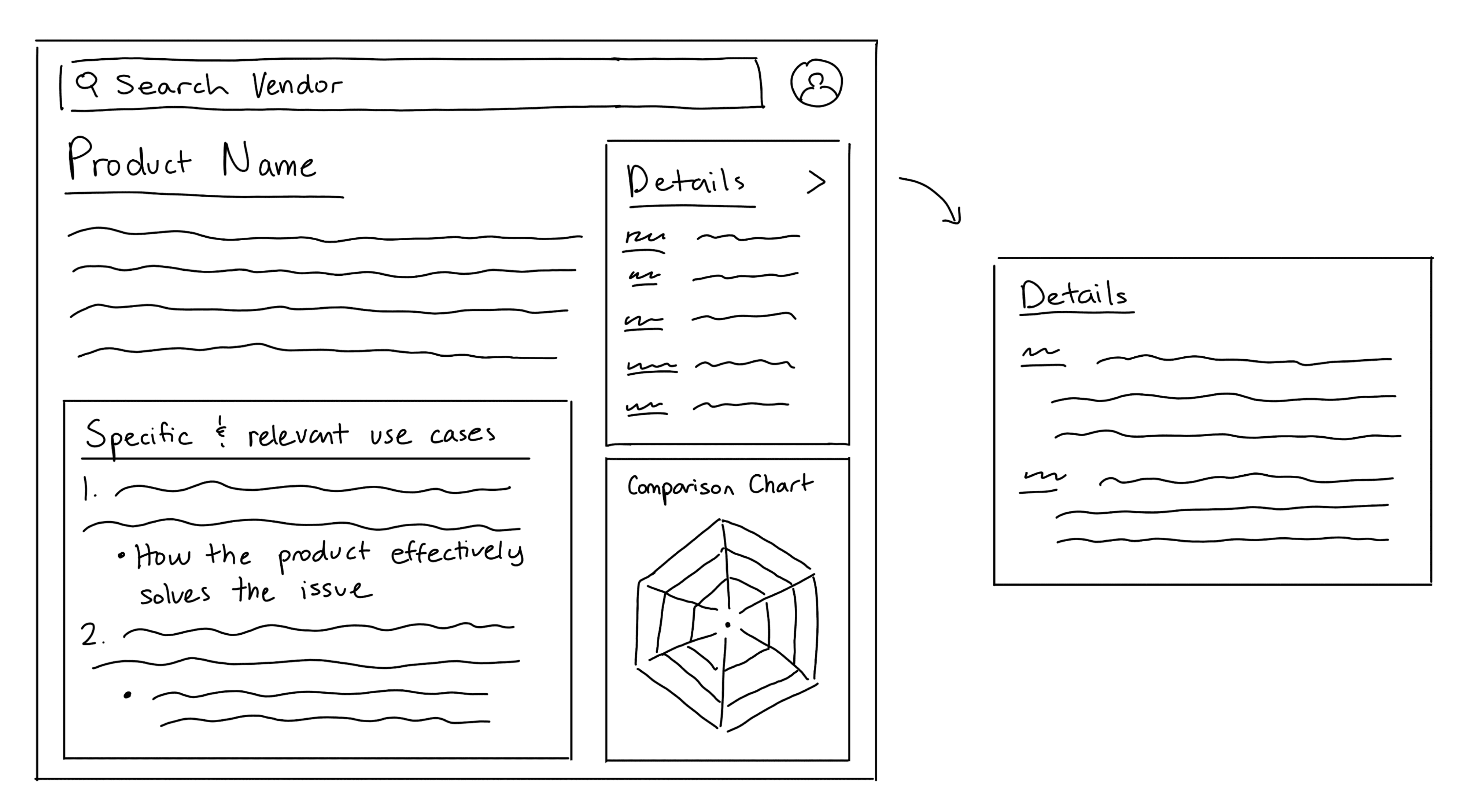
On to mid-fidelity wireframes
To develop the feature further, I explored how it could live directly on a vendor's product page. The Personalized Use Case Evaluation tool would pull from the buyer's uploaded RFP (a request for proposal outlining needs and constraints) to suggest tailored scenarios. The Technical Spec Breakdown then explains each feature and compares it to similar options.
For example, instead of just seeing "4 1/8" x 9 1/2" envelopes, buyers would learn why that size fits marketing kits or trifold brochures, when other sizes might be a better fit, and how quantity and pricing scale for their needs.
This flow helps buyers make informed, confident decisions with AI guidance.
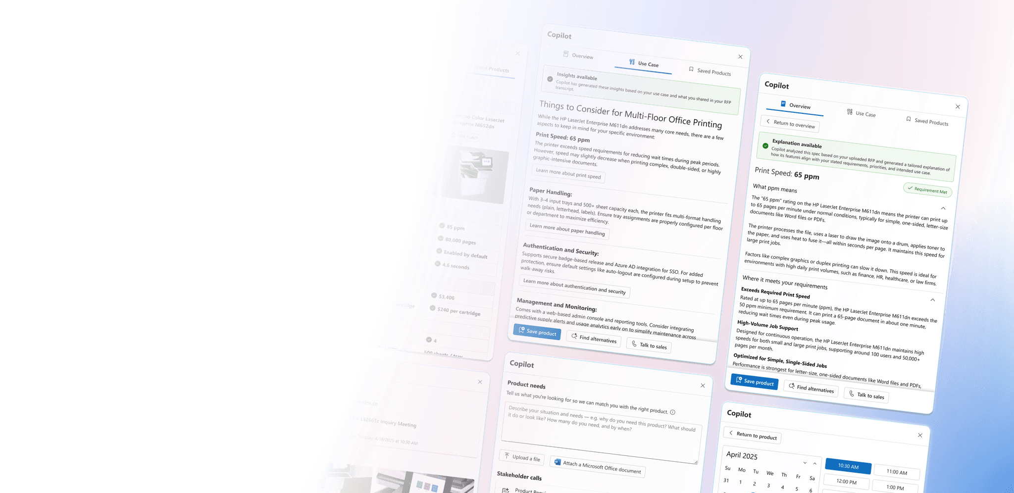
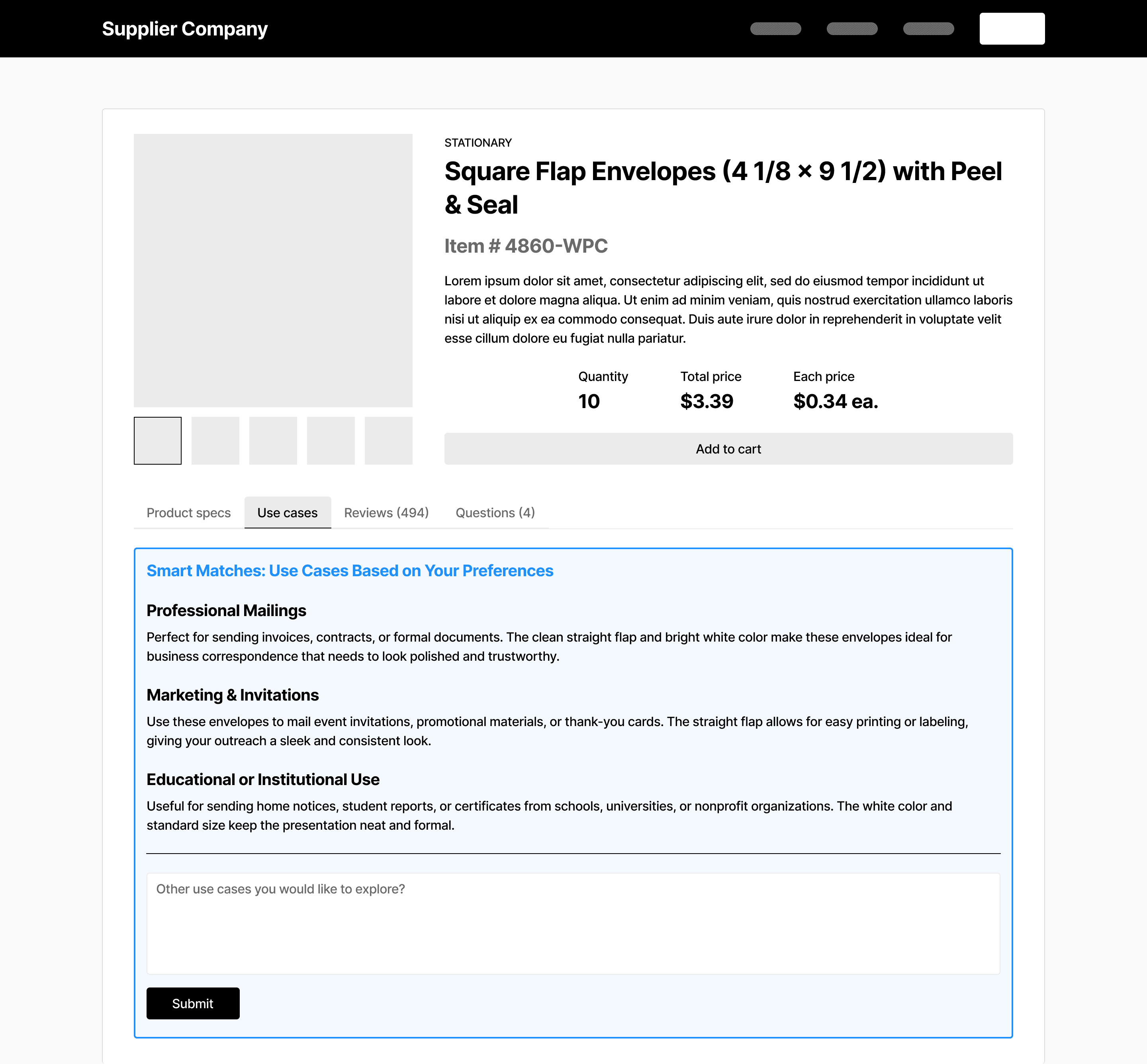
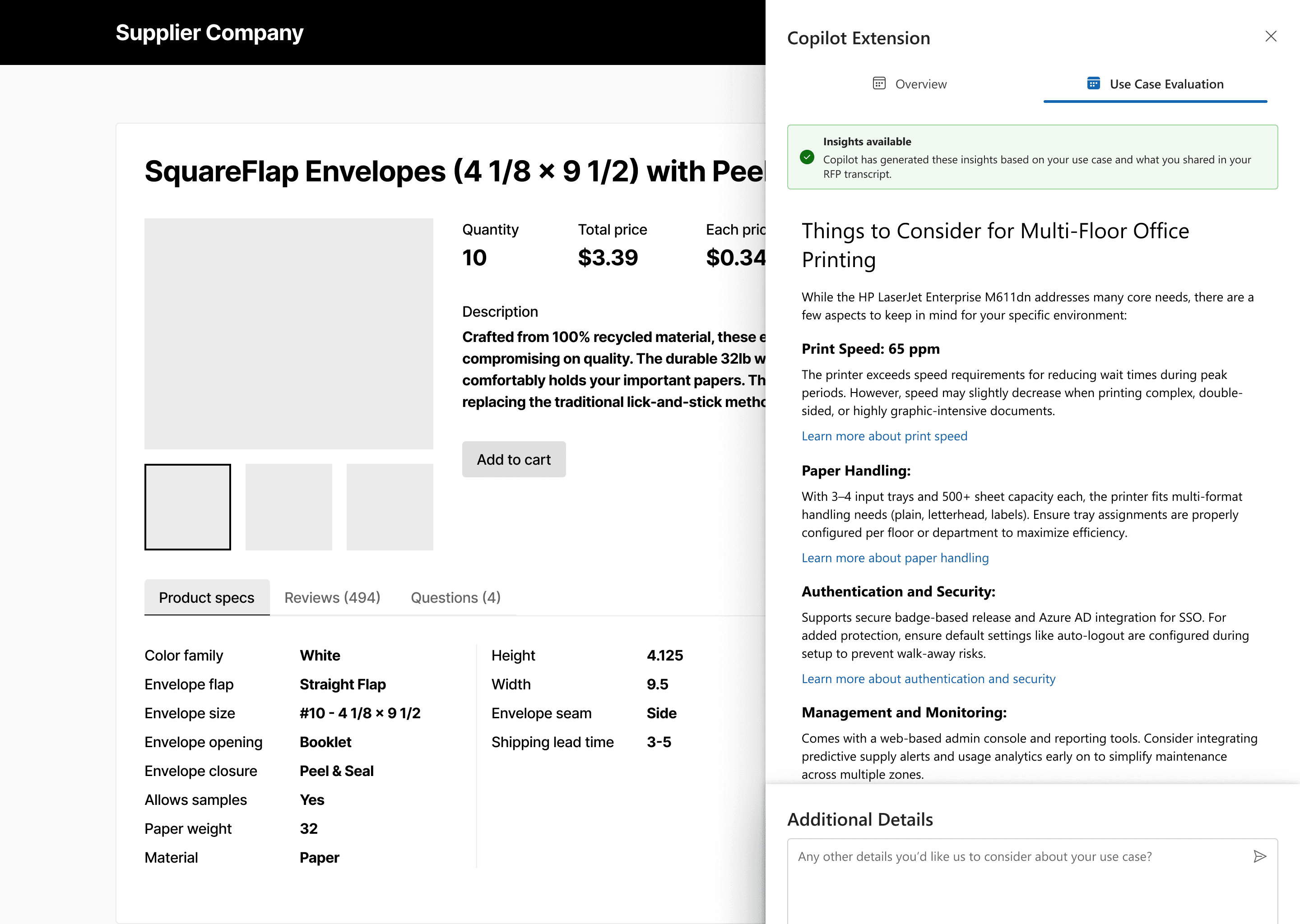
Use Case Evaluation
Note: Added a new feature that lets users supplement the AI with additional context if they feel details are missed.
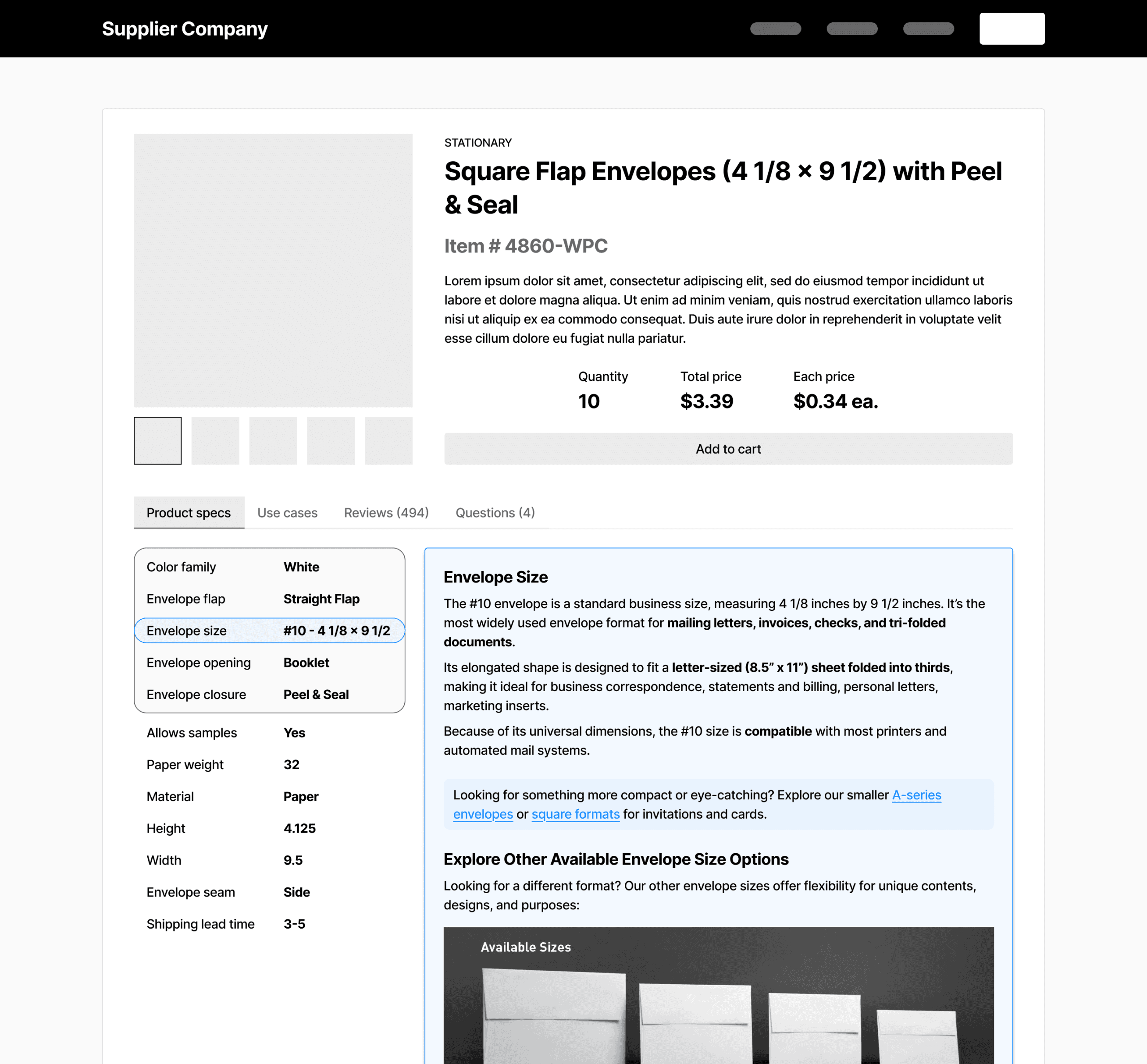
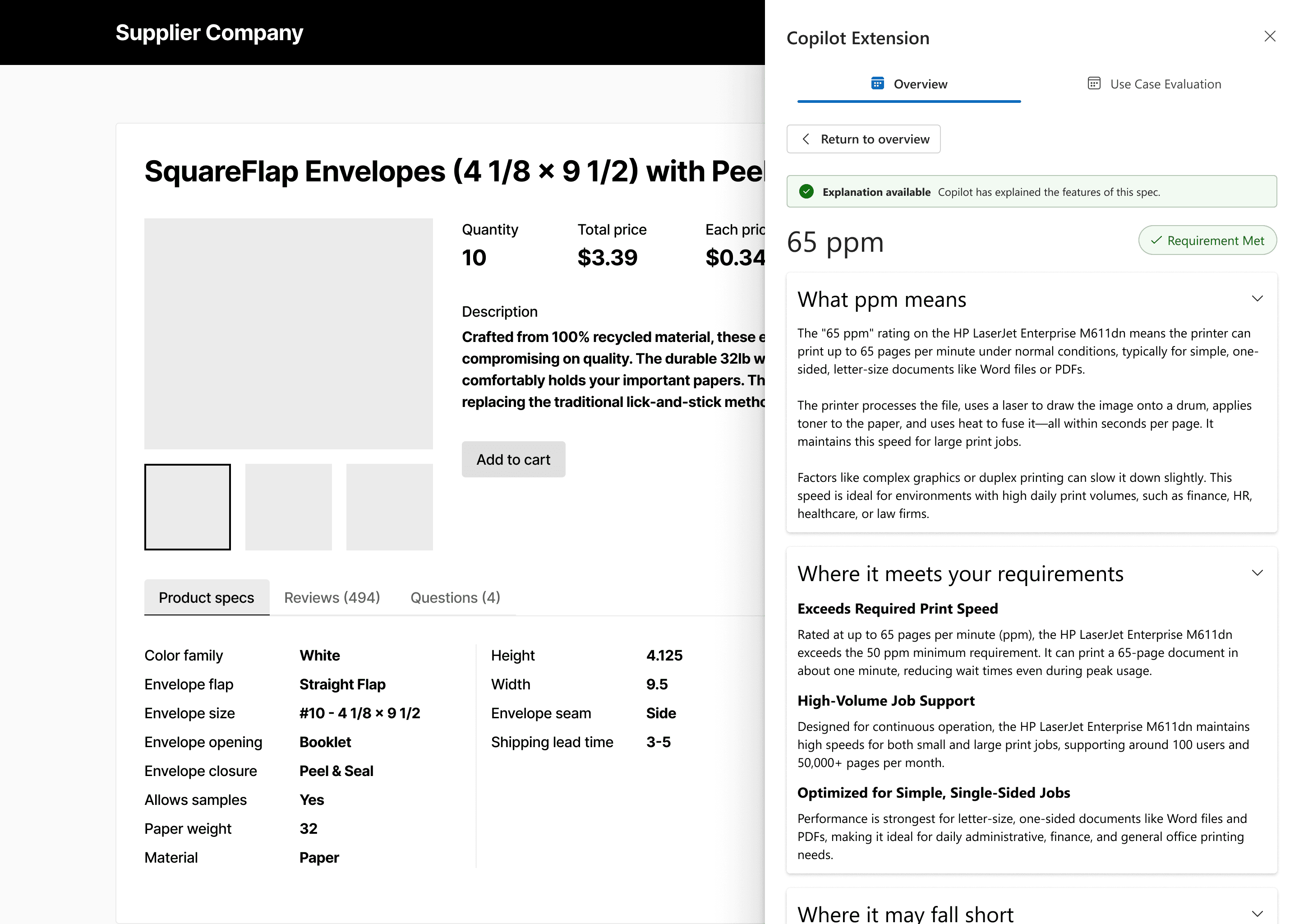
Technical Spec Breakdown
Note: Users can highlight a product spec to view its breakdown — seamlessly built into the experience.

About Feasibility
When considering real-world implementation, embedding this feature into every vendor's product page quickly proved unrealistic — vendor sites vary too widely in layout and structure.
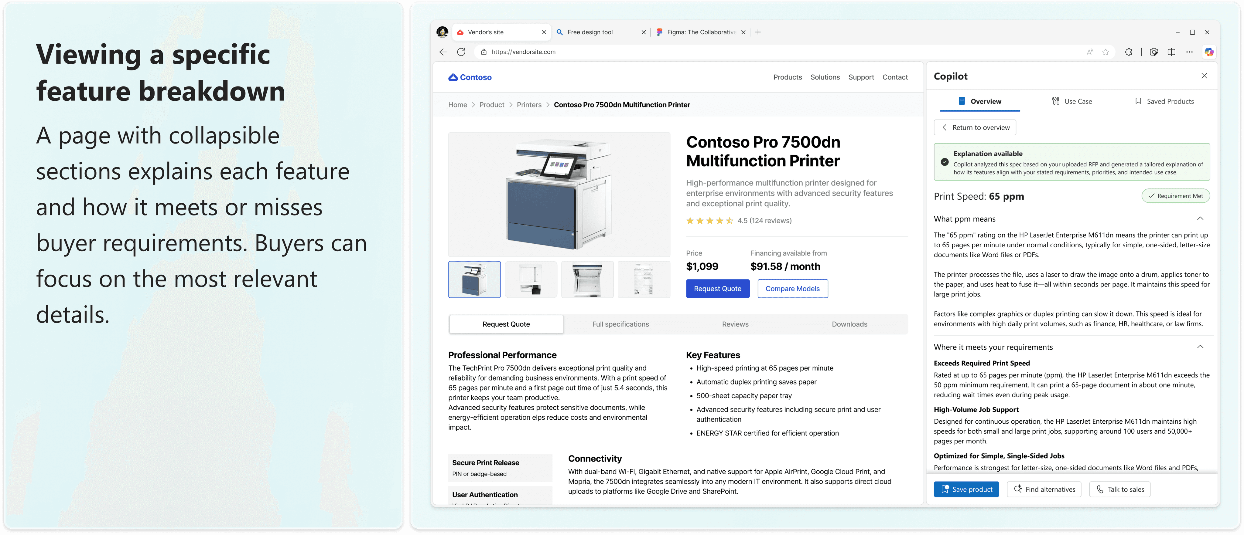
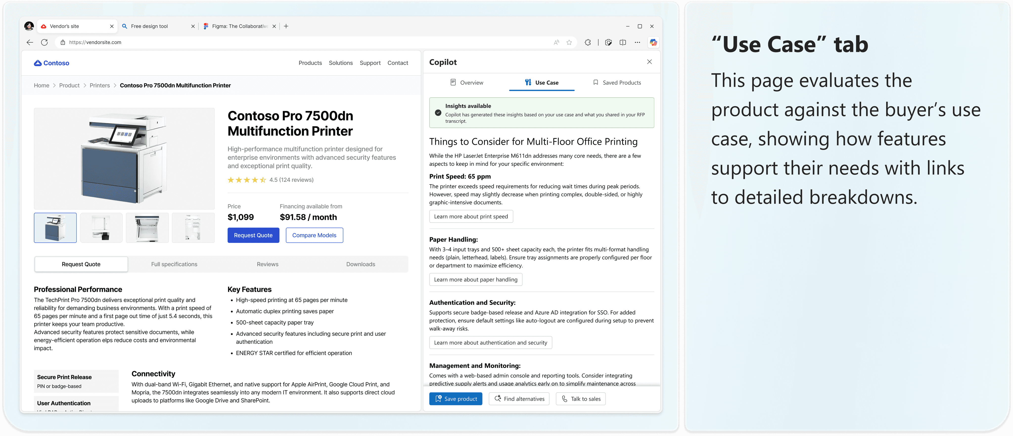
This led to a key pivot: instead of forcing integration, the feature became a browser extension — a plugin Microsoft could offer to buyers. It would serve as a cross-site assistant, helping buyers evaluate relevance and specs across any vendor site.
This shift kept the core value intact while making the solution scalable, flexible, and technically viable.
Use Case Evaluation
Technical Spec Breakdown
Refining the Design with the Bigger Picture in Mind
As I moved into high-fidelity designs, I revisited earlier ideas with a closer eye on how it would function in practice — especially the Use Case Evaluation feature.
Originally, I included an "Additional Details" input to give users more control over their results. But after further discussion, I decided to remove it. An initial RFP upload would already provide detailed context, and this added input introduced redundancy, risked confusing the user journey, and could even reduce trust in the AI's ability to interpret needs effectively.
Takeaway: More customizability isn’t always better — sometimes, reducing friction and reinforcing system confidence matters more.
The feature also shifted focus. Rather than suggesting possible use cases, it now helps buyers reflect on how the product fits their current needs based on the RFP.
For example, if the buyer's RFP mentions frequent, high-volume printing across multiple teams, the feature might highlight that another product offers *faster print speeds and higher capacity* than the baseline options.
the final FEATURE
Smart support, when you need it.

Reflection
How This Project Will Inform My Approach to Future Work
This was my first time working with a team of designers and it was an incredibly valuable experience. I gained so much insight from weekly critiques and design reviews, sharing ideas and aligning different perspectives to deliver a cohesive product vision.
What It Takes to Design for AI
Working in the AI space underscored how essential it is to understand both the capabilities of the technology and the needs of its users. Before jumping into design, we invested deeply in research — exploring Gen Z’s expectations, their existing AI habits, and the gaps in current solutions. That grounding will continue to shape how I approach problem spaces moving forward.
What It Means to Think Product Strategy
This project showed me how even the smallest features carry broader implications. I learned to zoom out from pixels in Figma to consider how features fit into product strategy, business goals, and implementation realities. Weekly feedback from the Microsoft team challenged me to think holistically — something I’ll carry into all future design decisions.
What Teamwork Taught Me About Design
Designing with others emphasized the value of shared critique, open feedback, and trust in the iterative process. I learned to adapt my work in response to team decisions and to contribute to a unified user experience — an approach I’ll bring into every collaborative setting.
What’s Next?
Building on the success of my first design consultancy project, I'm excited to grow further as a designer and strategist. Next semester, I'll be stepping into a Project Manager role with Design Consulting at Cornell — bringing forward everything I've learned about user-centered design, product strategy, and collaborative execution.

Thanks for stopping by!
Shoot me a message at ayc77@cornell.edu